Difference between revisions of "VPIV Widgets"
Jump to navigation
Jump to search

SupportAdmin (talk | contribs) |
SupportAdmin (talk | contribs) |
||
| (3 intermediate revisions by the same user not shown) | |||
| Line 9: | Line 9: | ||
|[[Image:EmailUsBtn.png|link=mailto:[email protected]?Subject=Help%20Needed%20Wiki&body=Type%20Message%20Here]] | |[[Image:EmailUsBtn.png|link=mailto:[email protected]?Subject=Help%20Needed%20Wiki&body=Type%20Message%20Here]] | ||
|} | |} | ||
< | <BR> | ||
---- | <div style="box-shadow: 0 0 10px 0 #b1d5ee inset; border-radius:5px; padding:10px; padding-left:20px; background:#ebf4fa;"> | ||
---- | <span style="color:#00719e; font-family: Helvetica; font-size:150%; font-variant: small-caps; padding-left:20px;">'''General Information'''</span> | ||
< | :*A Widget is a display that is created to show inside of a cell on a Panel. | ||
:*The construction of the Widget is exactly the same as constructing a Panel. | |||
</div> | |||
<BR> | |||
<div style="box-shadow: 0 0 10px 0 #b1d5ee inset; border-radius:5px; padding:10px; padding-left:20px; background:#ebf4fa;"> | |||
<span style="color:#00719e; font-family: Helvetica; font-size:150%; font-variant: small-caps; padding-left:20px;">'''Basic Functionality'''</span> | |||
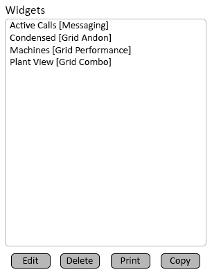
:*On the left side of the Widgets Home Screen, a list of all the Widgets added to the system will show in alphabetical order. | |||
:*On the Right side of the Widgets Home Screen, the Add New Widget menu will show. | |||
<div style="padding-left:30px;"> | |||
<gallery widths=306px heights=419px perrow=2> | |||
Image:WidgetList-1.png|link=VPIV Widgets | |||
Image:WidgetAdd-1.png|link=VPIV Widgets | |||
</gallery> | |||
</div> | |||
<BR> | |||
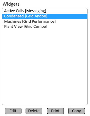
:<span style="color:#90A4AE; font-size:130%"> '''Widget Editing'''</span> | |||
:*A Widget can be Edited, Deleted, Printed or Copied. | |||
:*Select a Widget from the list so that it is highlighted. | |||
:*Select one of the buttons at the bottom of the list. | |||
<div style="padding-left:30px;"> | |||
<gallery widths=306px heights=419px> | |||
Image:WidgetList-2.png|link=VPIV Widgets | |||
</gallery> | |||
</div> | |||
::*'''Edit''' - us this button to edit any aspect of the Widget. | |||
::*'''Delete''' - use this button to permanently remove the Widget from the system. | |||
::*'''Print''' - use this button to create a print out of the Widget Setup. | |||
::*'''Copy''' - use this button to duplicate the Widget and access all editing aspects. | |||
<BR> | |||
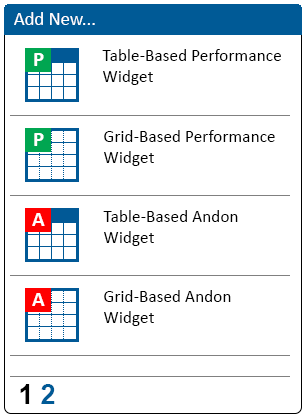
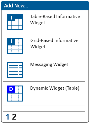
:<span style="color:#90A4AE; font-size:130%"> '''Add A Widget'''</span> | |||
:*There are 8 different types of Widget that can be created. | |||
:*Each Widget type is available under the Add New Widget Menu. | |||
<div style="padding-left:30px;"> | |||
<gallery widths=306px heights=419px perrow=2> | |||
Image:WidgetAdd-1.png|link=VPIV Widgets | |||
Image:WidgetAdd-2.png|link=VPIV Widgets | |||
</gallery> | |||
</div> | |||
<BR> | |||
:<span style="color:#90A4AE; font-size:120%">Performance Widgets</span> | |||
:*A Performance Widget provides the user with access & setup to all Tag & Cell Types. | |||
::*Table uses a Spreadsheet style of setup. | |||
::*Grid uses a freeform cell style of setup. | |||
<div style="padding-left:50px;"> | |||
<gallery widths=64px heights=64px perrow=2> | |||
Image:PerformTable.png|<div style="text-align: center; color:#00719e">'''Table - Performance'''</div>|link=VPIV Widgets | |||
Image:PerformGrid.png|<div style="text-align: center; color:#00719e">'''Grid - Performance'''</div>|link=VPIV Widgets | |||
</gallery> | |||
</div> | |||
<BR> | |||
:<span style="color:#90A4AE; font-size:120%">Andon Widgets</span> | |||
:*An Andon Widget provides the user with access & setup to Limited Tags and Cell Types. | |||
:*Used to show State & Duration of Alarms. | |||
::*Table uses a Spreadsheet style of setup. | |||
::*Grid uses a freeform cell style of setup. | |||
<div style="padding-left:50px;"> | |||
<gallery widths=64px heights=64px perrow=2> | |||
Image:AndonTable.png|<div style="text-align: center; color:#00719e">'''Table - Andon'''</div>|link=VPIV Widgets | |||
Image:AndonGrid.png|<div style="text-align: center; color:#00719e">'''Grid - Andon'''</div>|link=VPIV Widgets | |||
</gallery> | |||
</div> | |||
<BR> | |||
:<span style="color:#90A4AE; font-size:120%">Informative Widgets</span> | |||
:*An Informative Widget provides the user with NO Tag access. Cell Types are limited to Text & Image. | |||
:*Used to show Graphics or Text Messages. | |||
::*Table uses a Spreadsheet style of setup. | |||
::*Grid uses a freeform cell style of setup. | |||
<div style="padding-left:50px;"> | |||
<gallery widths=64px heights=64px perrow=2> | |||
Image:InformTable.png|<div style="text-align: center; color:#00719e">'''Table - Informative'''</div>|link=VPIV Widgets | |||
Image:InformGrid.png|<div style="text-align: center; color:#00719e">'''Grid - Informative'''</div>|link=VPIV Widgets | |||
</gallery> | |||
</div> | |||
<BR> | |||
:<span style="color:#90A4AE; font-size:120%">Messaging Widget</span> | |||
:*A Messaging Widget has no Tag access as it is not needed for this type of Widget. | |||
:*Used to show Text Messages. | |||
::*Creation is completed using a set of Steps & Options. | |||
<div style="padding-left:50px;"> | |||
<gallery widths=64px heights=64px perrow=2> | |||
Image:Messaging.png|<div style="text-align: center; color:#00719e">'''Messaging'''</div>|link=VPIV Widgets | |||
</gallery> | |||
</div> | |||
</div> | |||
<BR> | |||
<div style="box-shadow: 0 0 10px 0 #b1d5ee inset; border-radius:5px; padding:10px; padding-left:20px; background:#ebf4fa;"> | |||
<span style="color:#00719e; font-family: Helvetica; font-size:150%; font-variant: small-caps; padding-left:20px;">'''Table Widget - Tabs'''</span> | |||
:*After selecting to Add or Edit a Table Widget, a window will open with the following Properties. | |||
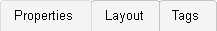
:<span style="color:#90A4AE; font-size:120%">Navigation</span> | |||
:*There are 3 tabs at the top of the page that allow the user to access the appropriate areas when creating or editing a Widget. | |||
<div style="padding-left:50px;"> | |||
<gallery widths=217px heights=31px> | |||
Image:VPTabs.png|link=VPIV Widgets | |||
</gallery> | |||
</div> | |||
::*'''Properties''' - this tab allows the user to name the Widget and to enter the refresh interval. | |||
::*'''Layout''' - this tab provides access to the rows, columns and cells of the table. Also provides access to cells on a grid Widget. | |||
::*'''Tags''' - this tab provides access to tag creation that monitors device data. | |||
</div> | |||
<BR> | |||
<div style="box-shadow: 0 0 10px 0 #b1d5ee inset; border-radius:5px; padding:10px; padding-left:20px; background:#ebf4fa;"> | |||
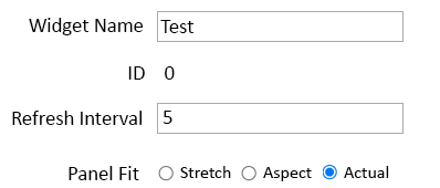
<span style="color:#00719e; font-family: Helvetica; font-size:150%; font-variant: small-caps; padding-left:20px;">'''Properties Tab'''</span> | |||
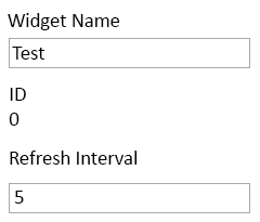
:*The Properties tab allows the user to enter a name and refresh interval for the Widget. | |||
<div style="padding-left:50px;"> | |||
<gallery widths=240px heights=205px> | |||
Image:WidgetProp-1.png|link=VPIV Widgets | |||
</gallery> | |||
</div> | |||
::*'''Widget Name''' - enter a name for the Widget. | |||
::*'''ID''' - assigned by the VP IV software. | |||
::*'''Refresh Interval''' - enter number of seconds - how often the Widget information should be refreshed. | |||
</div> | |||
<BR> | |||
<div style="box-shadow: 0 0 10px 0 #b1d5ee inset; border-radius:5px; padding:10px; padding-left:20px; background:#ebf4fa;"> | |||
<span style="color:#00719e; font-family: Helvetica; font-size:150%; font-variant: small-caps; padding-left:20px;">'''Layout Tab'''</span> | |||
:<span style="color:#90A4AE; font-size:120%">Table Editing Buttons</span> | |||
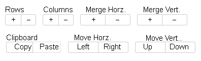
:*The Layout tab allows the user to create or edit the Widget using a Table format. | |||
:*At the top of the table will be all the buttons needed to manipulate the Table. | |||
<div style="padding-left:50px;"> | |||
<gallery widths=396px heights=120px> | |||
Image:VPButtons.png|link=VPIV Widgets | |||
</gallery> | |||
</div> | |||
::*'''Rows''' - use the Plus (+) & Minus (-) buttons to add and remove Rows from the table. | |||
::*'''Columns''' - use the Plus (+) & Minus (-) buttons to add and remove Columns from the table. | |||
::*'''Merge Horz.''' - use the Plus (+) & Minus (-) buttons to merge cells Horizontally in the table. | |||
::*'''Merge Vert.''' - use the Plus (+) & Minus (-) buttons to merge cells Vertically in the table. | |||
::*'''Clipboard''' - select a cell in the table - use the Copy or Paste button to either copy the selected cell or paste to the selected cell. | |||
::*'''Move Horz.''' use the Left & Right buttons to move cells Horizontally in the table. | |||
::*'''Move Vert.''' - use the Up & Down buttons to move cells Vertically in the table. | |||
<BR> | |||
:<span style="color:#90A4AE; font-size:120%">Table</span> | |||
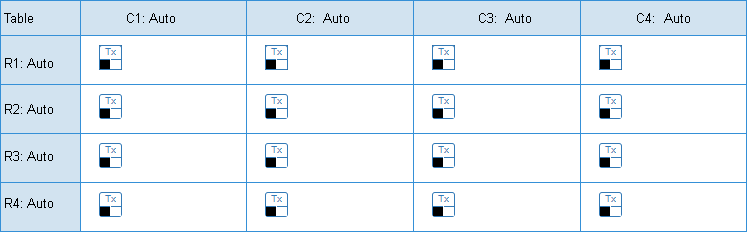
:*In the center of the Layout page will be the Table. | |||
:*This is a representation of how the Widget will look like when viewed. | |||
<div style="padding-left:50px;"> | |||
<gallery widths=747px heights=232px> | |||
Image:VPTable.png|link=VPIV Widgets | |||
</gallery> | |||
</div> | |||
::*'''Table''' - select first cell in the table (blue cell) to select the entire table and the properties. | |||
::*'''Row''' - select the first cell of any row (blue cell) to select the entire row and its properties. | |||
::*'''Column''' - select the first cell of any column (blue cell) to select the entire column and its properties. | |||
::*'''Cell''' - select any individual cell to access its properties/setup. | |||
<BR> | |||
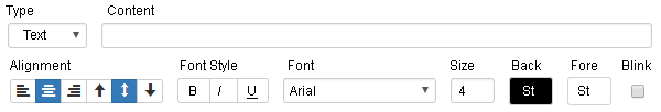
:<span style="color:#90A4AE; font-size:120%">Cell Properties</span> | |||
:*At the bottom of the Table, the user will find the Cell Properties Tools. | |||
:*After selecting a Cell in the table, the user can define what should be presented in it. | |||
<div style="padding-left:50px;"> | |||
<gallery widths=600px heights=102px> | |||
Image:VPFont.png|link=VPIV Widgets | |||
</gallery> | |||
</div> | |||
::*'''Type''' - select what type of cell you want to create - Text, Tag or Image. | |||
::*'''Content''' - depending on the type of cell you will have different options. Select/Enter the information that you want to show in the cell. | |||
::*'''Alignment''' - select how you want the content to be aligned in the cell - Right, Left, Center & Top, Bottom, Center. | |||
::*'''Font Style''' - with a Text or Tag cell, you can select the font be Bold, Italics or Underlined. | |||
::*'''Font''' - with a Text of Tag Cell, you can select the type of font you want to show in the cell. | |||
::*'''Size''' - with a Text or Tag Cell, you can select the font size for the cell. | |||
::*'''Back''' - select the color that you want the background of the cell to be. | |||
::*'''Fore''' - select the color that you want the font/text to be in the cell. | |||
::*'''Blink''' - select if you want to blink information in the cell. | |||
</div> | |||
<BR> | |||
<div style="box-shadow: 0 0 10px 0 #b1d5ee inset; border-radius:5px; padding:10px; padding-left:20px; background:#ebf4fa;"> | |||
<span style="color:#00719e; font-family: Helvetica; font-size:150%; font-variant: small-caps; padding-left:20px;">'''Tags Tab'''</span> | |||
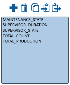
:<span style="color:#90A4AE; font-size:120%">Tools & List</span> | |||
:*On the Tags page allows the user the ability to query the system for status on a specific Device/Location. | |||
:*There is a list of all created Tags for the Widget. Above the list are the Tag Tools. | |||
<div style="padding-left:50px;"> | |||
<gallery widths=228px heights=276px> | |||
Image:PanelTable-1.png|link=VPIV Panels | |||
</gallery> | |||
</div> | |||
::*'''Add a Tag''' - select the Plus Icon to add a new tag. | |||
::*'''Delete a Tag''' - select a tag from the list so that it is highlighted - select the Trash Can Icon to remove the tag. | |||
::*'''Duplicate''' - select a tag from the list so that it is highlighted - select the Dual File Icon to duplicate the tag. | |||
::*'''Copy''' - select a tag from the list so that it is highlighted - select the Right Arrow Clip Board Icon to copy the tag. | |||
::*'''Paste''' - select the Left Arrow Clip Board icon to paste the copied tag to the list. | |||
::*'''List''' - all tags that have been added to the Widget will appear alphabetically in the list area. | |||
<BR> | |||
:<span style="color:#90A4AE; font-size:120%">Save & Exit</span> | |||
:*Once the Widget has been created or all editing has been completed, the user can select to Save the changes. | |||
:*At the top right side of all Layout Tabs, the user will see the Save buttons. | |||
<div style="padding-left:50px;"> | |||
<gallery widths=250px heights=30px> | |||
Image:VPSaveButton1.png|link=VPIV Widgets | |||
</gallery> | |||
</div> | |||
::*'''Save''' - once you have made a change to the Widget you can select the Save button to save your changes. | |||
::*'''Save & Exit''' - once you have mad a change to the Widget you can select the Save & Exit button to save your changes and exit the Widget editing page. | |||
::*'''Discard''' - once you have made a change to the Widget you can select the Discard button to NOT Save any of your changes and exit the Widget editing page. | |||
::*'''Exit''' - if you have not made any changes to the Widget, your only option will be an Exit button. | |||
</div> | |||
<BR> | |||
<div style="box-shadow: 0 0 10px 0 #b1d5ee inset; border-radius:5px; padding:10px; padding-left:20px; background:#ebf4fa;"> | |||
<span style="color:#00719e; font-family: Helvetica; font-size:150%; font-variant: small-caps; padding-left:20px;">'''Grid Widget - Tabs'''</span> | |||
:*After selecting to Add or Edit a Grid Widget, a window will open with the following Properties. | |||
:<span style="color:#90A4AE; font-size:120%">Tabs - Navigation</span> | |||
:*There are 3 tabs at the top of the page that allow the user to access the appropriate areas when creating or editing a Widget. | |||
<div style="padding-left:50px;"> | |||
<gallery widths=217px heights=31px> | |||
Image:VPTabs.png|link=VPIV Widgets | |||
</gallery> | |||
</div> | |||
::*'''Properties''' - this tab allows the user to name the Widget, enter the refresh interval, and set the aspect ratio. | |||
::*'''Layout''' - this tab provides access to the Cell creation & editing. | |||
::*'''Tags''' - this tab provides access to tag creation that monitors device data. | |||
</div> | |||
<BR> | |||
<div style="box-shadow: 0 0 10px 0 #b1d5ee inset; border-radius:5px; padding:10px; padding-left:20px; background:#ebf4fa;"> | |||
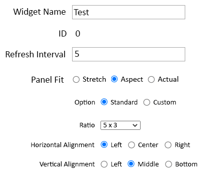
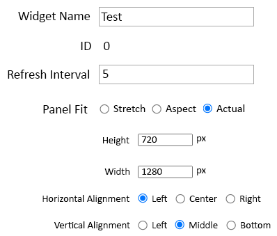
<span style="color:#00719e; font-family: Helvetica; font-size:150%; font-variant: small-caps; padding-left:20px;">'''Properties Tab'''</span> | |||
:*The Properties tab allows the user to enter a name, a refresh interval, and an aspect ratio for the Widget. | |||
<div style="padding-left:50px;"> | |||
<gallery widths=398px heights=170px> | |||
Image:WidgetProp-2A.png|link=VPIV Widgets | |||
</gallery> | |||
<gallery widths=398px heights=339px perrow=2> | |||
Image:WidgetProp-3.png|link=VPIV Widgets | |||
Image:WidgetProp-4.png|link=VPIV Widgets | |||
</gallery> | |||
</div> | |||
::*'''Widget Name''' - enter a name for the Widget. | |||
::*'''ID''' - assigned by the VP IV software. | |||
::*'''Refresh Interval''' - enter number of seconds - how often the Widget information should be refreshed. | |||
::*'''Widget Fit - Stretch''' - the Widget will stretch to the full size of the cell provided. | |||
::*'''Widget Fit - Aspect''' - setup the aspect ratio to use in the cell and select the alignment. | |||
::*'''Widget Fit - Actual Size''' - enter a size in pixels the Widget will be and select the alignment. | |||
</div> | |||
<BR> | |||
<div style="box-shadow: 0 0 10px 0 #b1d5ee inset; border-radius:5px; padding:10px; padding-left:20px; background:#ebf4fa;"> | |||
<span style="color:#00719e; font-family: Helvetica; font-size:150%; font-variant: small-caps; padding-left:20px;">'''Layout Tab'''</span> | |||
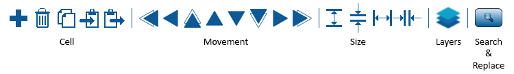
:<span style="color:#90A4AE; font-size:120%">Cell Tools</span> | |||
:*On the Layout tab, the user will find the Cell Tools at the top left of the Grid board. | |||
<div style="padding-left:50px;"> | |||
<gallery widths=750px heights=109px> | |||
Image:PanelGrid-2.png|link=VPIV Widgets | |||
</gallery> | |||
</div> | |||
::<span style="color:#90A4AE; font-size:120%">Size</span> | |||
::*'''Plus''' - select to add a new cell to the layout. | |||
::*'''Trash Can''' - after selecting a cell, select this icon to remove that cell. | |||
::*'''Document''' - after selecting a cell, select this icon to duplicate that cell. | |||
::*'''Clipboard Left''' - after selecting a cell, select this icon to copy that cell. | |||
::*'''Clipboard Right''' - after copying a cell, select this icon to paste the copied cell to the layout. | |||
::<span style="color:#90A4AE; font-size:120%">Movement</span> | |||
::*'''Double Left Arrow''' - after selecting a cell, select this icon to move the cell 5 points left. | |||
::*'''Single Left Arrow''' - after selecting a cell, select this icon to move the cell 1 point left. | |||
::*'''Double Up Arrow''' - after selecting a cell, select this icon to move the cell 5 points up. | |||
::*'''Single Up Arrow''' - after selecting a cell, select this icon to move the cell 1 point up. | |||
::*'''Single Down Arrow''' - after selecting a cell, select this icon to move the cell 1 point down. | |||
::*'''Double Down Arrow''' - after selecting a cell, select this icon to move the cell 5 points down. | |||
::*'''Single Right Arrow''' - after selecting a cell, select this icon to move the cell 1 point right. | |||
::*'''Double Right Arrow''' - after selecting a cell, select this icon to move the cell 5 points right. | |||
::<span style="color:#90A4AE; font-size:120%">Layers</span> | |||
::*'''Layers''' - when selecting this icon, the user can View and/or Hide certain items. When selected the user will find the following options: | |||
:::**'''Show Images''' - enable this option to show any images that have been placed in a Cell. | |||
:::**'''Show Cell Labels''' - enable this option to show the Cell dimensions (X, Y, Z) inside the Cell. | |||
:::**'''Show Anchors''' - enable this option to see the Cell Type icon in the top left side of the Cell. | |||
:::**'''Show Text''' - enable this option to see the Text entered for the Cell. | |||
::<span style="color:#90A4AE; font-size:120%">Search & Replace</span> | |||
::*'''Search''' - when selecting this icon, the user can search for a specific name and replace it. Generally used when copying cells. When selected the user will find the following options: | |||
:::**'''Find''' - use this field to enter the name that needs to be found/replaced. | |||
:::**'''Replace''' - use this field to enter the new name for the found search. | |||
<BR> | |||
:<span style="color:#90A4AE; font-size:120%">Cell Contents</span> | |||
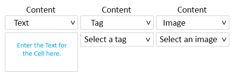
:*On the Layout tab, the user will find the Cell Content options at the bottom of the Grid. | |||
:*This area allows the user to define what the cell is by selecting the down arrow. | |||
<div style="padding-left:50px;"> | |||
<gallery widths=489px heights=161px> | |||
Image:WidgetGrid-1.png|link=VPIV Widgets | |||
</gallery> | |||
</div> | |||
::*'''Text''' - set the Cell to display Text. | |||
::*'''Tag''' - set the Cell to display a Tag Value. | |||
::*'''Image''' - set the Cell to display a selected Image. | |||
<BR> | |||
:<span style="color:#90A4AE; font-size:120%">Size & Position</span> | |||
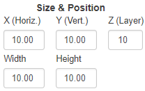
:*On the Layout tab, the user will find the Size & Position options at the bottom of the Grid to the right side of Cell Contents. | |||
:*This area allows the user to define the size of the Cell and where the Cell is to be on the Grid. | |||
<div style="padding-left:50px;"> | |||
<gallery widths=208px heights=131px> | |||
Image:VPPosition.png|link=VPIV Widgets | |||
</gallery> | |||
</div> | |||
::*'''X (Horiz.)''' - set this to adjust the amount of points the cell is left/right. | |||
::*'''Y (Vert.)''' - set this to adjust the amount of points the cell is up/down. | |||
::*'''Z (Layer)''' - set this to adjust the depth level for the cell. | |||
::*'''Width''' - set this to adjust how many points wide the cell is (maximum of 100). | |||
::*'''Height''' set this to adjust how many points tall the cell is (maximum of 100). | |||
<BR> | |||
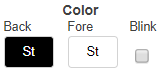
:<span style="color:#90A4AE; font-size:120%">Color</span> | |||
:*On the Layout tab, the user will find the Color options at the bottom of the Grid to the right side of Size & Position. | |||
:*This area allows the user to define the Cell background color and the Cell text color. | |||
<div style="padding-left:50px;"> | |||
<gallery widths=161px heights=71px> | |||
Image:VPGridColor.png|link=VPIV Widgets | |||
</gallery> | |||
</div> | |||
::*'''Back''' - select this swatch to change the background color of the cell. | |||
::*'''Fore''' - select this swatch to change the foreground (text) color of the cell. | |||
::*'''Blink''' - select this option to setup cell blinking. | |||
<BR> | |||
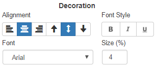
:<span style="color:#90A4AE; font-size:120%">Decoration</span> | |||
:*On the Layout tab, the user will find the Decoration options at the bottom of the Grid to the right side of Color. | |||
:*This area allows the user to define how the Text will display in the Cell. | |||
<div style="padding-left:50px;"> | |||
<gallery widths=306px heights=132px> | |||
Image:VPDecoration.png|link=VPIV Widgets | |||
</gallery> | |||
</div> | |||
::*'''Alignment''' - select one of the icons to adjust the horizontal or vertical alignment of the text in the cell. | |||
::*'''Font Style''' - select one or more of the icons to make the text Bold, Italics and/or Underlined. | |||
::*'''Font''' - select the down arrow to select the font used in the cell. | |||
::*'''Size''' - use this field to enter the percentage of the cell to fill with your Text. | |||
<BR> | |||
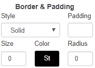
:<span style="color:#90A4AE; font-size:120%">Border</span> | |||
:*On the Layout tab, the user will find the Border options at the bottom of the Grid to the right side of Decorations. | |||
:*This area allows the user to define the Border of a Cell. | |||
<div style="padding-left:50px;"> | |||
<gallery widths=188px heights=135px> | |||
Image:VPBorder.png|link=VPIV Widgets | |||
</gallery> | |||
</div> | |||
::*'''Style''' - select the down arrow to select the type of border to be used on the cell. | |||
::*'''Padding''' - enter the number of points to pad the edges of the cell from Text or Images. | |||
::*'''Size''' - enter the number of points for the thickness of the line. | |||
::*'''Color''' - select the swatch to choose the color of the border. | |||
::*'''Radius''' - enter the angle/radius of the corners of the cell. Entering a Zero makes the cell a Square. | |||
<BR> | |||
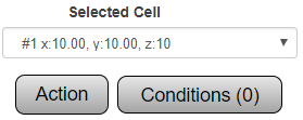
:<span style="color:#90A4AE; font-size:120%">Selected Cell</span> | |||
:*On the Layout tab, the user will find the Cell Selection options at the bottom of the Grid to the right side of Border. | |||
:*This area allows the user to select or alter specific Cells on the Grid. | |||
<div style="padding-left:50px;"> | |||
<gallery widths=279px heights=111px> | |||
Image:VPSelected.png|link=VPIV Widgets | |||
</gallery> | |||
</div> | |||
::*'''Selected Cell''' - select the down arrow to select the cell by position. | |||
::*'''Action''' - select this button to setup specific actions. | |||
::*'''Conditions''' - select this button to setup Content, Color & Visibility conditions. | |||
</div> | |||
<BR> | |||
<div style="box-shadow: 0 0 10px 0 #b1d5ee inset; border-radius:5px; padding:10px; padding-left:20px; background:#ebf4fa;"> | |||
<span style="color:#00719e; font-family: Helvetica; font-size:150%; font-variant: small-caps; padding-left:20px;">'''Tags Tab'''</span> | |||
:<span style="color:#90A4AE; font-size:120%">Tools & List</span> | |||
:*On the Tags page allows the user the ability to query the system for status on a specific Device/Location. | |||
:*There is a list of all created Tags for the Widget. Above the list are the Tag Tools. | |||
<div style="padding-left:50px;"> | |||
<gallery widths=228px heights=276px> | |||
Image:PanelTable-1.png|link=VPIV Widgets | |||
</gallery> | |||
</div> | |||
::*'''Add a Tag''' - select the Plus Icon to add a new tag. | |||
::*'''Delete a Tag''' - select a tag from the list so that it is highlighted - select the Trash Can Icon to remove the tag. | |||
::*'''Duplicate''' - select a tag from the list so that it is highlighted - select the Dual File Icon to duplicate the tag. | |||
::*'''Copy''' - select a tag from the list so that it is highlighted - select the Right Arrow Clip Board Icon to copy the tag. | |||
::*'''Paste''' - select the Left Arrow Clip Board icon to paste the copied tag to the list. | |||
::*'''List''' - all tags that have been added to the Widget will appear alphabetically in the list area. | |||
<BR> | |||
:<span style="color:#90A4AE; font-size:120%">Save & Exit</span> | |||
:*Once the Widget has been created or all editing has been completed, the user can select to Save the changes. | |||
:*At the top right side of all Layout Tabs, the user will see the Save buttons. | |||
<div style="padding-left:50px;"> | |||
<gallery widths=250px heights=30px> | |||
Image:VPSaveButton1.png|link=VPIV Widgets | |||
</gallery> | |||
</div> | |||
::*'''Save''' - once you have made a change to the Widget you can select the Save button to save your changes. | |||
::*'''Save & Exit''' - once you have mad a change to the Widget you can select the Save & Exit button to save your changes and exit the Widget editing page. | |||
::*'''Discard''' - once you have made a change to the Widget you can select the Discard button to NOT Save any of your changes and exit the Widget editing page. | |||
::*'''Exit''' - if you have not made any changes to the Widget, your only option will be an Exit button. | |||
</div> | |||
<BR> | |||
<div style="box-shadow: 0 0 10px 0 #b1d5ee inset; border-radius:5px; padding:10px; padding-left:20px; background:#ebf4fa;"> | |||
<span style="color:#00719e; font-family: Helvetica; font-size:150%; font-variant: small-caps; padding-left:10px;">'''Keyword Search'''</span> | |||
{|style="margin:auto;" | |||
{|class="wikitable" style="align:center; width:600px;" | |||
|- | |- | ||
!<span style="color:#0054a6; font-size:120%"><big>Type Subject or Key Word to Query Archives</big></span> | |||
|- | |- | ||
| | |<inputbox>type=search</inputbox> | ||
< | |||
|} | |} | ||
|} | |} | ||
</div> | |||
<br> | <br> | ||
[[File:VC Footer.png|center]] | [[File:VC Footer.png|center|link=Main Page]] | ||
{|style="background:transparent; color:black" border="0" height="200" align="center" valign="bottom" cellpadding=10px cellspacing=10px | {|style="background:transparent; color:black" border="0" height="200" align="center" valign="bottom" cellpadding=10px cellspacing=10px | ||
|+style="background:transparent| | |+style="background:transparent| | ||
|-align="center" | |-align="center" | ||
| | | | ||
|[[File:LinkedIn.png|Follow Us On LinkedIn|link=https://www.linkedin.com/company/versacall | |[[File:LinkedIn.png|Follow Us On LinkedIn|link=https://www.linkedin.com/company/versacall/]] | ||
| | | | ||
|[[File:BlogIcon.png|View our Blog|link=https://www.versacall.com/blog/]] | |[[File:BlogIcon.png|View our Blog|link=https://www.versacall.com/blog/]] | ||
|} | |} | ||
Latest revision as of 18:24, 21 November 2023

|

|

|
General Information
- A Widget is a display that is created to show inside of a cell on a Panel.
- The construction of the Widget is exactly the same as constructing a Panel.
Basic Functionality
- On the left side of the Widgets Home Screen, a list of all the Widgets added to the system will show in alphabetical order.
- On the Right side of the Widgets Home Screen, the Add New Widget menu will show.
- Widget Editing
- A Widget can be Edited, Deleted, Printed or Copied.
- Select a Widget from the list so that it is highlighted.
- Select one of the buttons at the bottom of the list.
- Edit - us this button to edit any aspect of the Widget.
- Delete - use this button to permanently remove the Widget from the system.
- Print - use this button to create a print out of the Widget Setup.
- Copy - use this button to duplicate the Widget and access all editing aspects.
- Add A Widget
- There are 8 different types of Widget that can be created.
- Each Widget type is available under the Add New Widget Menu.
- Performance Widgets
- A Performance Widget provides the user with access & setup to all Tag & Cell Types.
- Table uses a Spreadsheet style of setup.
- Grid uses a freeform cell style of setup.
 Table - Performance
 Grid - Performance
- Andon Widgets
- An Andon Widget provides the user with access & setup to Limited Tags and Cell Types.
- Used to show State & Duration of Alarms.
- Table uses a Spreadsheet style of setup.
- Grid uses a freeform cell style of setup.
 Table - Andon
 Grid - Andon
- Informative Widgets
- An Informative Widget provides the user with NO Tag access. Cell Types are limited to Text & Image.
- Used to show Graphics or Text Messages.
- Table uses a Spreadsheet style of setup.
- Grid uses a freeform cell style of setup.
 Table - Informative
 Grid - Informative
- Messaging Widget
- A Messaging Widget has no Tag access as it is not needed for this type of Widget.
- Used to show Text Messages.
- Creation is completed using a set of Steps & Options.
 Messaging
Table Widget - Tabs
- After selecting to Add or Edit a Table Widget, a window will open with the following Properties.
- Navigation
- There are 3 tabs at the top of the page that allow the user to access the appropriate areas when creating or editing a Widget.
- Properties - this tab allows the user to name the Widget and to enter the refresh interval.
- Layout - this tab provides access to the rows, columns and cells of the table. Also provides access to cells on a grid Widget.
- Tags - this tab provides access to tag creation that monitors device data.
Properties Tab
- The Properties tab allows the user to enter a name and refresh interval for the Widget.
- Widget Name - enter a name for the Widget.
- ID - assigned by the VP IV software.
- Refresh Interval - enter number of seconds - how often the Widget information should be refreshed.
Layout Tab
- Table Editing Buttons
- The Layout tab allows the user to create or edit the Widget using a Table format.
- At the top of the table will be all the buttons needed to manipulate the Table.
- Rows - use the Plus (+) & Minus (-) buttons to add and remove Rows from the table.
- Columns - use the Plus (+) & Minus (-) buttons to add and remove Columns from the table.
- Merge Horz. - use the Plus (+) & Minus (-) buttons to merge cells Horizontally in the table.
- Merge Vert. - use the Plus (+) & Minus (-) buttons to merge cells Vertically in the table.
- Clipboard - select a cell in the table - use the Copy or Paste button to either copy the selected cell or paste to the selected cell.
- Move Horz. use the Left & Right buttons to move cells Horizontally in the table.
- Move Vert. - use the Up & Down buttons to move cells Vertically in the table.
- Table
- In the center of the Layout page will be the Table.
- This is a representation of how the Widget will look like when viewed.
- Table - select first cell in the table (blue cell) to select the entire table and the properties.
- Row - select the first cell of any row (blue cell) to select the entire row and its properties.
- Column - select the first cell of any column (blue cell) to select the entire column and its properties.
- Cell - select any individual cell to access its properties/setup.
- Cell Properties
- At the bottom of the Table, the user will find the Cell Properties Tools.
- After selecting a Cell in the table, the user can define what should be presented in it.
- Type - select what type of cell you want to create - Text, Tag or Image.
- Content - depending on the type of cell you will have different options. Select/Enter the information that you want to show in the cell.
- Alignment - select how you want the content to be aligned in the cell - Right, Left, Center & Top, Bottom, Center.
- Font Style - with a Text or Tag cell, you can select the font be Bold, Italics or Underlined.
- Font - with a Text of Tag Cell, you can select the type of font you want to show in the cell.
- Size - with a Text or Tag Cell, you can select the font size for the cell.
- Back - select the color that you want the background of the cell to be.
- Fore - select the color that you want the font/text to be in the cell.
- Blink - select if you want to blink information in the cell.
Tags Tab
- Tools & List
- On the Tags page allows the user the ability to query the system for status on a specific Device/Location.
- There is a list of all created Tags for the Widget. Above the list are the Tag Tools.
- Add a Tag - select the Plus Icon to add a new tag.
- Delete a Tag - select a tag from the list so that it is highlighted - select the Trash Can Icon to remove the tag.
- Duplicate - select a tag from the list so that it is highlighted - select the Dual File Icon to duplicate the tag.
- Copy - select a tag from the list so that it is highlighted - select the Right Arrow Clip Board Icon to copy the tag.
- Paste - select the Left Arrow Clip Board icon to paste the copied tag to the list.
- List - all tags that have been added to the Widget will appear alphabetically in the list area.
- Save & Exit
- Once the Widget has been created or all editing has been completed, the user can select to Save the changes.
- At the top right side of all Layout Tabs, the user will see the Save buttons.
- Save - once you have made a change to the Widget you can select the Save button to save your changes.
- Save & Exit - once you have mad a change to the Widget you can select the Save & Exit button to save your changes and exit the Widget editing page.
- Discard - once you have made a change to the Widget you can select the Discard button to NOT Save any of your changes and exit the Widget editing page.
- Exit - if you have not made any changes to the Widget, your only option will be an Exit button.
Grid Widget - Tabs
- After selecting to Add or Edit a Grid Widget, a window will open with the following Properties.
- Tabs - Navigation
- There are 3 tabs at the top of the page that allow the user to access the appropriate areas when creating or editing a Widget.
- Properties - this tab allows the user to name the Widget, enter the refresh interval, and set the aspect ratio.
- Layout - this tab provides access to the Cell creation & editing.
- Tags - this tab provides access to tag creation that monitors device data.
Properties Tab
- The Properties tab allows the user to enter a name, a refresh interval, and an aspect ratio for the Widget.
- Widget Name - enter a name for the Widget.
- ID - assigned by the VP IV software.
- Refresh Interval - enter number of seconds - how often the Widget information should be refreshed.
- Widget Fit - Stretch - the Widget will stretch to the full size of the cell provided.
- Widget Fit - Aspect - setup the aspect ratio to use in the cell and select the alignment.
- Widget Fit - Actual Size - enter a size in pixels the Widget will be and select the alignment.
Layout Tab
- Cell Tools
- On the Layout tab, the user will find the Cell Tools at the top left of the Grid board.
- Size
- Plus - select to add a new cell to the layout.
- Trash Can - after selecting a cell, select this icon to remove that cell.
- Document - after selecting a cell, select this icon to duplicate that cell.
- Clipboard Left - after selecting a cell, select this icon to copy that cell.
- Clipboard Right - after copying a cell, select this icon to paste the copied cell to the layout.
- Movement
- Double Left Arrow - after selecting a cell, select this icon to move the cell 5 points left.
- Single Left Arrow - after selecting a cell, select this icon to move the cell 1 point left.
- Double Up Arrow - after selecting a cell, select this icon to move the cell 5 points up.
- Single Up Arrow - after selecting a cell, select this icon to move the cell 1 point up.
- Single Down Arrow - after selecting a cell, select this icon to move the cell 1 point down.
- Double Down Arrow - after selecting a cell, select this icon to move the cell 5 points down.
- Single Right Arrow - after selecting a cell, select this icon to move the cell 1 point right.
- Double Right Arrow - after selecting a cell, select this icon to move the cell 5 points right.
- Layers
- Layers - when selecting this icon, the user can View and/or Hide certain items. When selected the user will find the following options:
- Show Images - enable this option to show any images that have been placed in a Cell.
- Show Cell Labels - enable this option to show the Cell dimensions (X, Y, Z) inside the Cell.
- Show Anchors - enable this option to see the Cell Type icon in the top left side of the Cell.
- Show Text - enable this option to see the Text entered for the Cell.
- Search & Replace
- Search - when selecting this icon, the user can search for a specific name and replace it. Generally used when copying cells. When selected the user will find the following options:
- Find - use this field to enter the name that needs to be found/replaced.
- Replace - use this field to enter the new name for the found search.
- Size
- Cell Contents
- On the Layout tab, the user will find the Cell Content options at the bottom of the Grid.
- This area allows the user to define what the cell is by selecting the down arrow.
- Text - set the Cell to display Text.
- Tag - set the Cell to display a Tag Value.
- Image - set the Cell to display a selected Image.
- Size & Position
- On the Layout tab, the user will find the Size & Position options at the bottom of the Grid to the right side of Cell Contents.
- This area allows the user to define the size of the Cell and where the Cell is to be on the Grid.
- X (Horiz.) - set this to adjust the amount of points the cell is left/right.
- Y (Vert.) - set this to adjust the amount of points the cell is up/down.
- Z (Layer) - set this to adjust the depth level for the cell.
- Width - set this to adjust how many points wide the cell is (maximum of 100).
- Height set this to adjust how many points tall the cell is (maximum of 100).
- Color
- On the Layout tab, the user will find the Color options at the bottom of the Grid to the right side of Size & Position.
- This area allows the user to define the Cell background color and the Cell text color.
- Back - select this swatch to change the background color of the cell.
- Fore - select this swatch to change the foreground (text) color of the cell.
- Blink - select this option to setup cell blinking.
- Decoration
- On the Layout tab, the user will find the Decoration options at the bottom of the Grid to the right side of Color.
- This area allows the user to define how the Text will display in the Cell.
- Alignment - select one of the icons to adjust the horizontal or vertical alignment of the text in the cell.
- Font Style - select one or more of the icons to make the text Bold, Italics and/or Underlined.
- Font - select the down arrow to select the font used in the cell.
- Size - use this field to enter the percentage of the cell to fill with your Text.
- Border
- On the Layout tab, the user will find the Border options at the bottom of the Grid to the right side of Decorations.
- This area allows the user to define the Border of a Cell.
- Style - select the down arrow to select the type of border to be used on the cell.
- Padding - enter the number of points to pad the edges of the cell from Text or Images.
- Size - enter the number of points for the thickness of the line.
- Color - select the swatch to choose the color of the border.
- Radius - enter the angle/radius of the corners of the cell. Entering a Zero makes the cell a Square.
- Selected Cell
- On the Layout tab, the user will find the Cell Selection options at the bottom of the Grid to the right side of Border.
- This area allows the user to select or alter specific Cells on the Grid.
- Selected Cell - select the down arrow to select the cell by position.
- Action - select this button to setup specific actions.
- Conditions - select this button to setup Content, Color & Visibility conditions.
Tags Tab
- Tools & List
- On the Tags page allows the user the ability to query the system for status on a specific Device/Location.
- There is a list of all created Tags for the Widget. Above the list are the Tag Tools.
- Add a Tag - select the Plus Icon to add a new tag.
- Delete a Tag - select a tag from the list so that it is highlighted - select the Trash Can Icon to remove the tag.
- Duplicate - select a tag from the list so that it is highlighted - select the Dual File Icon to duplicate the tag.
- Copy - select a tag from the list so that it is highlighted - select the Right Arrow Clip Board Icon to copy the tag.
- Paste - select the Left Arrow Clip Board icon to paste the copied tag to the list.
- List - all tags that have been added to the Widget will appear alphabetically in the list area.
- Save & Exit
- Once the Widget has been created or all editing has been completed, the user can select to Save the changes.
- At the top right side of all Layout Tabs, the user will see the Save buttons.
- Save - once you have made a change to the Widget you can select the Save button to save your changes.
- Save & Exit - once you have mad a change to the Widget you can select the Save & Exit button to save your changes and exit the Widget editing page.
- Discard - once you have made a change to the Widget you can select the Discard button to NOT Save any of your changes and exit the Widget editing page.
- Exit - if you have not made any changes to the Widget, your only option will be an Exit button.
Keyword Search
| Type Subject or Key Word to Query Archives |
|---|

|
|