Difference between revisions of "VPIV Widgets"
SupportAdmin (talk | contribs) |
SupportAdmin (talk | contribs) |
||
| Line 6: | Line 6: | ||
'''1. Main Screen''' - under the Widget heading, the following option are available: | '''1. Main Screen''' - under the Widget heading, the following option are available: | ||
[[File:Widget1.png]] | [[File:Widget1.png]] | ||
'''a. List''' - all created widgets will appear in the list. | '''a. List''' - all created widgets will appear in the list. | ||
| Line 19: | Line 19: | ||
'''2. Adding Widgets''' - there 7 different types of widgets available under the Add New menu each with specific properties. | '''2. Adding Widgets''' - there 7 different types of widgets available under the Add New menu each with specific properties. | ||
[[File:Widget2.png]] | [[File:Widget2.png]] | ||
'''a.''' [[File:PerformTable.png]] Performance Table - allows the user to create a widget for any monitoring point type. The editing layout is similar to and Excel spreadsheet. | '''a.''' [[File:PerformTable.png]] Performance Table - allows the user to create a widget for any monitoring point type. The editing layout is similar to and Excel spreadsheet. | ||
| Line 36: | Line 36: | ||
==Navigation== | ==Navigation== | ||
The Performance and Andon widget will have all the tabs described below. The Informative widget will not have a Tags tab and a Messaging widget will have a different editing interface. | The Performance and Andon widget will have all the tabs described below. The Informative widget will not have a Tags tab and a Messaging widget will have a different editing interface. | ||
'''1. Tabs'''- there will be up to 3 tabs available. | '''1. Tabs'''- there will be up to 3 tabs available. | ||
[[File:VPTabs.png]] | |||
'''a. Properties''' - this tab allows the user to name the widget and to enter the refresh interval. | '''a. Properties''' - this tab allows the user to name the widget and to enter the refresh interval. | ||
'''b. Layout''' - this tab provides access to the rows, columns and cells of the table. Also provides access to cells on a grid widget. | '''b. Layout''' - this tab provides access to the rows, columns and cells of the table. Also provides access to cells on a grid widget. | ||
'''c. Tags''' - this tab provides access to tag creation that monitors device data. | '''c. Tags''' - this tab provides access to tag creation that monitors device data. | ||
'''2. Properties Page - Table''' - there are 3 sections. | '''2. Properties Page - Table''' - there are 3 sections. | ||
[[File:VPProperties2.png]] | |||
'''a. Widget Name''' - enter a name for the widget. | '''a. Widget Name''' - enter a name for the widget. | ||
'''b. ID''' - assigned by the VP IV software. | '''b. ID''' - assigned by the VP IV software. | ||
'''c. Refresh Interval''' - enter number of seconds - how often the widget information should be refreshed. | '''c. Refresh Interval''' - enter number of seconds - how often the widget information should be refreshed. | ||
'''3. Properties Page - Grid''' - there are 4 sections. | '''3. Properties Page - Grid''' - there are 4 sections. | ||
[[File:VPProperties.png]] | |||
'''a. Widget Name''' - enter a name for the widget. | '''a. Widget Name''' - enter a name for the widget. | ||
| Line 58: | Line 73: | ||
'''ii. Aspect''' - setup the aspect ratio to use in the cell and select the alignment. | '''ii. Aspect''' - setup the aspect ratio to use in the cell and select the alignment. | ||
'''iii. Actual Size''' - enter a size in pixels the widget will be and select the alignment. | '''iii. Actual Size''' - enter a size in pixels the widget will be and select the alignment. | ||
'''4. Layout Page - Table''' - access the rows, columns and cells. | '''4. Layout Page - Table''' - access the rows, columns and cells. | ||
[[File:VPButtons.png]] | |||
'''a. Cell Editing''' - use the buttons to add, remove, merge, copy or move cells. | '''a. Cell Editing''' - use the buttons to add, remove, merge, copy or move cells. | ||
[[File:VPTable.png]] | |||
'''b. Table''' - click on any individual row, column or cell to view its properties. | '''b. Table''' - click on any individual row, column or cell to view its properties. | ||
[[File:VPFont.png]] | |||
'''c. Cell Properties''' - use the tools for content, font style, font size, font color, actions and conditions. | '''c. Cell Properties''' - use the tools for content, font style, font size, font color, actions and conditions. | ||
'''5. Layout Page - Grid''' - access the cells placed on the grid space. | '''5. Layout Page - Grid''' - access the cells placed on the grid space. | ||
[[File:VPPropButtons.png]] | |||
'''a. Cell''' - use the icons to manipulate the selected cell. | '''a. Cell''' - use the icons to manipulate the selected cell. | ||
[[File:VPMoveButtons.png]] | |||
'''b. Movement''' - use the icons to move the selected cell. | '''b. Movement''' - use the icons to move the selected cell. | ||
[[File:VPSizeButtons.png]] | |||
'''c. Size''' - use the icons to increase or decrease the size of the selected cell. | '''c. Size''' - use the icons to increase or decrease the size of the selected cell. | ||
[[File:VPLayers.png]] | |||
'''d. Layers''' - select what to show on the widget layers. | '''d. Layers''' - select what to show on the widget layers. | ||
[[File:CPContent.png]] | |||
'''e. Content''' - select what to show in the cell. | '''e. Content''' - select what to show in the cell. | ||
[[File:VPPosition.png]] | |||
'''f. Size & Position''' - setup position on grid, layer and size. | '''f. Size & Position''' - setup position on grid, layer and size. | ||
[[File:VPGridColor.png]] | |||
'''g. Color''' - setup the cell colors. | '''g. Color''' - setup the cell colors. | ||
[[File:VPDecoration.png]] | |||
'''h. Decoration''' - setup the appearance of fonts in the cell. | '''h. Decoration''' - setup the appearance of fonts in the cell. | ||
[[File:VPBorder.png]] | |||
'''i. Border & Padding''' - setup cell borders and padding size from other cells. | '''i. Border & Padding''' - setup cell borders and padding size from other cells. | ||
[[File:VPSelected.png]] | |||
'''j. Selected Cell''' - view cell location on the grid and setup actions & conditions for the cell. | '''j. Selected Cell''' - view cell location on the grid and setup actions & conditions for the cell. | ||
'''6. Tags''' - access tag creation tools. | '''6. Tags''' - access tag creation tools. | ||
[[File:VPPropButtons.png]] | |||
'''a. Tool Box''' - use the icons to add, remove, copy and paste tags. | '''a. Tool Box''' - use the icons to add, remove, copy and paste tags. | ||
[[File:VPTagList.png]] | |||
'''b. List''' - all created tags will show on the list. Select a tag to view properties. | '''b. List''' - all created tags will show on the list. Select a tag to view properties. | ||
'''7. Panel Save''' - 3 buttons are available on all widget editing pages. | '''7. Panel Save''' - 3 buttons are available on all widget editing pages. | ||
[[File:VPSaveButton1.png]] [[File:VPSaveButton2.png]] | |||
'''a. Save''' - select to save widget changes and stay on the editing page. | '''a. Save''' - select to save widget changes and stay on the editing page. | ||
Revision as of 20:38, 20 October 2017
Widget
A widget is a panel/display that is made to fit inside a cell on a regular panel. The construction of the Widget is exactly the same as constructing a regular panel. A widget is used to provide the user the ability to mix and match what is seen on a panel(s).
Basic Functionality
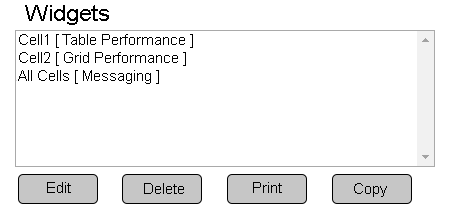
1. Main Screen - under the Widget heading, the following option are available:
    a. List - all created widgets will appear in the list.
    b. Edit - select a widget - select Edit button to access the editing page.
    c. Delete - select a widget - select Delete button to remove.
    d. Print - select a widget - select Print button to create a print out of all widget information.
    e. Copy - select a widget - select Copy button to duplicate the widget and access the editing page.
2. Adding Widgets - there 7 different types of widgets available under the Add New menu each with specific properties.
a.Performance Table - allows the user to create a widget for any monitoring point type. The editing layout is similar to and Excel spreadsheet. b.
Performance Grid - allows the user to create a widget for any monitoring point type. The editing layout is a blank space where cells can be added and moved anywhere within the space provided. c.
Andon Table - allows the user to create a widget for alarms only. The editing layout is similar to and Excel spreadsheet. b.
Andon Grid - allows the user to create a widget for alarms only. The editing layout is a blank space where cells can be added and moved anywhere within the space provided. d.
Informative Table - allows the user to create a widget with text & images only. The editing layout is similar to and Excel spreadsheet. e.
Informative Grid - allows the user to create a widget with text & images only. The editing layout is a blank space where cells can be added and moved anywhere within the space provided. f.
Messaging - allows the user to create a widget that will display the text associated with the default communications path.
Editing Page
The Performance and Andon widget will have all the tabs described below. The Informative widget will not have a Tags tab and a Messaging widget will have a different editing interface.
1. Tabs- there will be up to 3 tabs available.
    a. Properties - this tab allows the user to name the widget and to enter the refresh interval.
    b. Layout - this tab provides access to the rows, columns and cells of the table. Also provides access to cells on a grid widget.
    c. Tags - this tab provides access to tag creation that monitors device data.
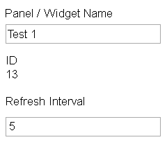
2. Properties Page - Table - there are 3 sections.
    a. Widget Name - enter a name for the widget.
    b. ID - assigned by the VP IV software.
    c. Refresh Interval - enter number of seconds - how often the widget information should be refreshed.
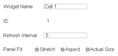
3. Properties Page - Grid - there are 4 sections.
    a. Widget Name - enter a name for the widget.
    b. ID - assigned by the VP IV software.
    c. Refresh Interval - enter number of seconds - how often the widget information should be refreshed.
    d. Panel Fit - determines how the widget will fit in a cell.
         i. Stretch -  the panel will stretch to the full size of the cell provided.
         ii. Aspect -  setup the aspect ratio to use in the cell and select the alignment.
         iii. Actual Size - enter a size in pixels the widget will be and select the alignment.
4. Layout Page - Table - access the rows, columns and cells.
a. Cell Editing - use the buttons to add, remove, merge, copy or move cells.
b. Table - click on any individual row, column or cell to view its properties.
c. Cell Properties - use the tools for content, font style, font size, font color, actions and conditions.
5. Layout Page - Grid - access the cells placed on the grid space.
a. Cell - use the icons to manipulate the selected cell.
b. Movement - use the icons to move the selected cell.
c. Size - use the icons to increase or decrease the size of the selected cell.
d. Layers - select what to show on the widget layers.
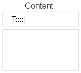
e. Content - select what to show in the cell.
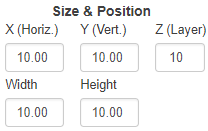
f. Size & Position - setup position on grid, layer and size.
g. Color - setup the cell colors.
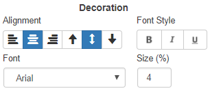
h. Decoration - setup the appearance of fonts in the cell.
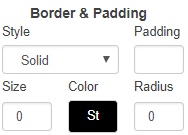
i. Border & Padding - setup cell borders and padding size from other cells.
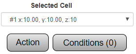
j. Selected Cell - view cell location on the grid and setup actions & conditions for the cell.
6. Tags - access tag creation tools.
a. Tool Box - use the icons to add, remove, copy and paste tags.
b. List - all created tags will show on the list. Select a tag to view properties.
7. Panel Save - 3 buttons are available on all widget editing pages.
    a. Save - select to save widget changes and stay on the editing page.
    b. Save & Exit - select to save widget changes and return to widget main page.
    c. Discard - select to remove widget changes and return to widget main page.
    d. Exit - button will appear when adding or editing a new panel and nothing has been selected. When the first selection is made the Discard button will appear.
