Difference between revisions of "VT3000 Data Field"
Jump to navigation
Jump to search
SupportAdmin (talk | contribs) |
SupportAdmin (talk | contribs) m (Text replacement - "https://www.linkedin.com/company/versacall-technologies-inc-/mycompany/" to "https://www.linkedin.com/company/versacall/") |
||
| (5 intermediate revisions by the same user not shown) | |||
| Line 1: | Line 1: | ||
== | {|style="background:transparent; color:black" border="0" height="230" align="center" valign="bottom" | ||
|+style="background:transparent| | |||
|-align="center" | |||
| | |||
|[[Image:CallUsBtn.png|Call Now 858-677-6766]] | |||
| | |||
|[[Image:SubmitTckBtn.png|link=https://www.versacall.com/customer-support/service-ticket]] | |||
| | |||
|[[Image:EmailUsBtn.png|link=mailto:support@versacall.com?Subject=Help%20Needed%20Wiki&body=Type%20Message%20Here]] | |||
|} | |||
<br> | |||
< | |||
---- | ---- | ||
---- | ---- | ||
<br> | |||
[[File:GeneralHeader.png]] | |||
=== | <br> | ||
{|style="margin:left; width: 800px; background:#eaf3ff; padding:5px; border:2px solid #000000;" | |||
|- | |||
|<big>'''Overview'''</big> | |||
{|style="margin:left; width: 800px; background:#F0F0F0; padding:5px; border:2px solid #000000;" | |||
|valign="top" | | |||
|- | |||
|A Data Field is used to enter or select specific data at the start, acknowledgement or end of an alarm. Data Fields can be used with Processes at the start, during or end. An example would be to enter an employee name or select a specific person or part. A data field can only be added to a process or an alarm. | |||
|} | |||
|} | |||
<br> | |||
---- | ---- | ||
---- | ---- | ||
<br> | |||
[[File:DetailHeader.png]] | |||
<br> | |||
{|style="margin:left; width: 800px; background:#eaf3ff; padding:5px; border:2px solid #000000;" | |||
|- | |||
|<big>'''Basic Functionality'''</big> | |||
[[File: | {|style="margin:left; width: 800px; background:#F0F0F0; padding:5px; border:2px solid #000000;" | ||
|valign="top" | | |||
|- | |||
''' | |Data Fields can be added, deleted, duplicated, copied or moved using the Icons in the Monitoring Points toolbox. | ||
{|style="margin:left;" | |||
|valign="top" | | |||
{|class="wikitable" style="background:white; align:center; width:775px;" | |||
''' | |- | ||
|[[File:AddData2.png|center|100px]] || [[File:Delete2.png|center|100px]] || [[File:Copy2.png|center|100px]] || [[File:CopyClip2.png|center|100px]] | |||
''' | |- | ||
|style="text-align:center" | '''Add a Data Field''' || style="text-align:center" | '''Delete a Data Field''' || style="text-align:center" | '''Duplicate a Data Field''' || style="text-align:center" | '''Copy a Data Field''' | |||
|} | |||
{|class="wikitable" style="background:white; align:center; width:775px;" | |||
|- | |||
|[[File:PasteClip2.png|center|100px]] || [[File:MoveUp2.png|center|100px]] || [[File:MoveDown2.png|center|100px]] | |||
|- | |||
''' | |style="text-align:center" | '''Paste a Data Field''' || style="text-align:center" | '''Move a Data Field Up''' || style="text-align:center" | '''Move a Data Field Down''' | ||
|} | |||
|} | |||
|} | |||
|} | |||
<br> | |||
---- | ---- | ||
<br> | |||
{|style="margin:left; width: 800px; background:#eaf3ff; padding:5px; border:2px solid #000000;" | |||
== | |- | ||
|<big>'''Data Field Properties'''</big> | |||
{|style="margin:left; width: 800px; background:#F0F0F0; padding:5px; border:2px solid #000000;" | |||
|valign="top" | | |||
[[File: | |- | ||
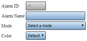
|After selecting to Add or Edit a Data Field, the Data Field Properties page will load. The following options are available for either selection: | |||
{|style="margin:left;" | |||
''' | |valign="top" | | ||
{|class="wikitable" style="background:white; align:center; width:775px;" | |||
''' | |- | ||
|[[File:AlarmProp.png|center|279px]] | |||
''' | |- | ||
|'''Data Field ID''' - assigned/generated by the VersaCall Software. | |||
''' | |- | ||
|'''Data Field Name''' - enter the name of the Data Field. | |||
|} | |||
{|class="wikitable" style="background:white; align:center; width:775px;" | |||
!style="text-align:center" | <big>'''Process Modes'''</big> | |||
|- | |||
|'''At Start''' - Data Field will appear when the Process is Started. | |||
''' | |- | ||
|'''During''' - Data Field can be accessed via a link on the tablet after the Process has been started. | |||
|- | |||
|'''At End''' - Data Field will appear when the Process is Ended/Stopped. | |||
|} | |||
{|class="wikitable" style="background:white; align:center; width:775px;" | |||
!style="text-align:center" | <big>'''Alarm Modes'''</big> | |||
|- | |||
|'''On Set''' - Data Field will appear when the Alarm is Set/Started. | |||
|- | |||
|'''On Acknowledge''' - Data Field will appear when the Alarm is Acknowledged. | |||
|- | |||
|'''On Clear''' - Data Field will appear with the Alarm is Cleared/Stopped. | |||
|} | |||
|} | |||
|} | |||
|} | |||
<br> | |||
---- | ---- | ||
<br> | |||
{|style="margin:left; width: 800px; background:#eaf3ff; padding:5px; border:2px solid #000000;" | |||
==== | |- | ||
|<big>'''Source Type'''</big> | |||
{|style="margin:left; width: 800px; background:#F0F0F0; padding:5px; border:2px solid #000000;" | |||
|valign="top" | | |||
[[File: | |- | ||
|After setting up the Name and Mode, you will select the Source Type. There are 8 different Source Types, each is explained in the sections below. | |||
|} | |||
''' | |} | ||
<br> | |||
''' | {|style="margin:left; width: 800px; background:#eaf3ff; padding:5px; border:2px solid #000000;" | ||
|- | |||
''' | |<big>'''Key Input'''</big> | ||
{|style="margin:left; width: 800px; background:#F0F0F0; padding:5px; border:2px solid #000000;" | |||
|valign="top" | | |||
|- | |||
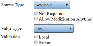
|Allows the user to enter information into a data field by using a keyboard. | |||
''' | {|style="margin:left;" | ||
|valign="top" | | |||
{|class="wikitable" style="background:white; align:center; width:775px;" | |||
|- | |||
|[[File:KeyInput.png|center|368px]] | |||
|- | |||
|'''Not Required''' - select this when the user is not required to enter data into the data field. | |||
''' | |- | ||
|'''Allow Modification Anytime''' - select this to allow the user to change the Data Field entry at any time. | |||
|- | |||
|'''Value Type - Text''' - allows the user to enter both characters and numbers into the field. | |||
|- | |||
|'''Value Type - Numeric Integer''' - allows the user to enter a whole number into the field. | |||
|- | |||
|'''Value Type - Numeric Decimal''' - allows the user to enter any number with a decimal place into the field. | |||
|- | |||
|'''Value Type - True/False''' - allows the user to select Yes or No. | |||
|- | |||
|'''Validation''' - this is a customized option - please contact VersaCall Support for assistance. | |||
|} | |||
|} | |||
|} | |||
|} | |||
<br> | |||
{|style="margin:left; width: 800px; background:#eaf3ff; padding:5px; border:2px solid #000000;" | |||
|- | |||
|<big>'''NFC'''</big> | |||
{|style="margin:left; width: 800px; background:#F0F0F0; padding:5px; border:2px solid #000000;" | |||
|valign="top" | | |||
|- | |||
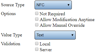
|Allows the user to enter information into a data field using a NFC enabled tablet. | |||
{|style="margin:left;" | |||
|valign="top" | | |||
{|class="wikitable" style="background:white; align:center; width:775px;" | |||
|- | |||
|[[File:NFC.png|center|369px]] | |||
|- | |||
|'''Not Required''' - select this when the user is not required to enter data into the data field. | |||
|- | |||
|'''Allow Modification Anytime''' - select this to allow the user to change the Data Field entry at any time. | |||
|- | |||
|'''Allow Manual Override''' - select this to allow the user to enter data using the keyboard. | |||
|- | |||
|'''Value Type - Text''' - allows the user to enter both characters and numbers into the field. | |||
|- | |||
|'''Value Type - Numeric Integer''' - allows the user to enter a whole number into the field. | |||
|- | |||
|'''Value Type - Numeric Decimal''' - allows the user to enter any number with a decimal place into the field. | |||
|- | |||
|'''Value Type - True/False''' - allows the user to select Yes or No. | |||
|- | |||
|'''Validation''' - this is a customized option - please contact VersaCall Support for assistance. | |||
|} | |||
|} | |||
|} | |||
|} | |||
<br> | |||
{|style="margin:left; width: 800px; background:#eaf3ff; padding:5px; border:2px solid #000000;" | |||
|- | |||
|<big>'''Barcode Reader'''</big> | |||
{|style="margin:left; width: 800px; background:#F0F0F0; padding:5px; border:2px solid #000000;" | |||
|valign="top" | | |||
|- | |||
|Allows the user to enter information into a data field using a Barcode Scanner connected to the tablet. | |||
{|style="margin:left;" | |||
|valign="top" | | |||
{|class="wikitable" style="background:white; align:center; width:775px;" | |||
|- | |||
|[[File:Barcode.png|center|369px]] | |||
|- | |||
|'''Not Required''' - select this when the user is not required to enter data into the data field. | |||
|- | |||
|'''Allow Modification Anytime''' - select this to allow the user to change the Data Field entry at any time. | |||
|- | |||
|'''Allow Manual Override''' - select this to allow the user to enter data using the keyboard. | |||
|- | |||
|'''Value Type - Text''' - allows the user to enter both characters and numbers into the field. | |||
|- | |||
|'''Value Type - Numeric Integer''' - allows the user to enter a whole number into the field. | |||
|- | |||
|'''Value Type - Numeric Decimal''' - allows the user to enter any number with a decimal place into the field. | |||
|- | |||
|'''Value Type - True/False''' - allows the user to select Yes or No. | |||
|- | |||
|'''Validation''' - this is a customized option - please contact VersaCall Support for assistance. | |||
|} | |||
|} | |||
|} | |||
|} | |||
<br> | |||
{|style="margin:left; width: 800px; background:#eaf3ff; padding:5px; border:2px solid #000000;" | |||
|- | |||
|<big>'''List'''</big> | |||
{|style="margin:left; width: 800px; background:#F0F0F0; padding:5px; border:2px solid #000000;" | |||
|valign="top" | | |||
|- | |||
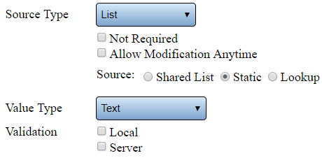
|Allows the user to select items from a list to enter information into a data field. | |||
{|style="margin:left;" | |||
|valign="top" | | |||
{|class="wikitable" style="background:white; align:center; width:775px;" | |||
|- | |||
|[[File:List.png|center|460px]] | |||
|- | |||
|'''Not Required''' - select this when the user is not required to enter data into the data field. | |||
|- | |||
|'''Allow Modification Anytime''' - select this to allow the user to change the Data Field entry at any time. | |||
|- | |||
|'''Source - Shared List''' - select to use a Shared List for selection. | |||
|- | |||
|'''Source - Static''' - select to use a list only on this device. | |||
|- | |||
|'''Source - Lookup''' - this is a custom option -please contact VersaCall Support for assistance. | |||
|- | |||
|'''Value Type - Text''' - allows the user to enter both characters and numbers into the field. | |||
|- | |||
|'''Value Type - Numeric Integer''' - allows the user to enter a whole number into the field. | |||
|- | |||
|'''Value Type - Numeric Decimal''' - allows the user to enter any number with a decimal place into the field. | |||
|- | |||
|'''Value Type - True/False''' - allows the user to select Yes or No. | |||
|- | |||
|'''Validation''' - this is a customized option - please contact VersaCall Support for assistance. | |||
|} | |||
|} | |||
|} | |||
|} | |||
<br> | |||
{|style="margin:left; width: 800px; background:#eaf3ff; padding:5px; border:2px solid #000000;" | |||
|- | |||
|<big>'''Tally'''</big> | |||
{|style="margin:left; width: 800px; background:#F0F0F0; padding:5px; border:2px solid #000000;" | |||
|valign="top" | | |||
|- | |||
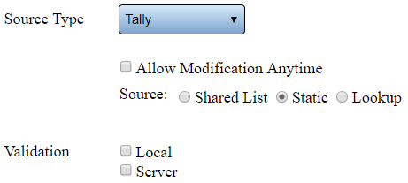
|Allows the user to enter a numeric value into a data field using a plus or minus button. | |||
{|style="margin:left;" | |||
|valign="top" | | |||
{|class="wikitable" style="background:white; align:center; width:775px;" | |||
|- | |||
|[[File:Tally.png|center|461px]] | |||
|- | |||
|'''Allow Modification Anytime''' - select this to allow the user to change the Data Field entry at any time. | |||
|- | |||
|'''Source - Shared List''' - select to use a Shared List for Tally items. | |||
|- | |||
|'''Source - Static''' - select to use a list only on this device for Tally items. | |||
|- | |||
|'''Source - Lookup''' - this is a custom option -please contact VersaCall Support for assistance. | |||
|- | |||
|'''Validation''' - this is a customized option - please contact VersaCall Support for assistance. | |||
|} | |||
|} | |||
|} | |||
|} | |||
<br> | |||
{|style="margin:left; width: 800px; background:#eaf3ff; padding:5px; border:2px solid #000000;" | |||
|- | |||
|<big>'''Checklist'''</big> | |||
{|style="margin:left; width: 800px; background:#F0F0F0; padding:5px; border:2px solid #000000;" | |||
|valign="top" | | |||
|- | |||
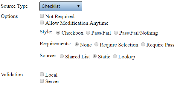
|Allows the user to check items from a list to enter information into a data field. | |||
{|style="margin:left;" | |||
|valign="top" | | |||
{|class="wikitable" style="background:white; align:center; width:775px;" | |||
|- | |||
|[[File:Checklist.png|center|592px]] | |||
|- | |||
|'''Not Required''' - select this when the user is not required to enter data into the data field. | |||
|- | |||
|'''Allow Modification Anytime''' - select this to allow the user to change the Data Field entry at any time. | |||
|- | |||
|'''Style - Checkbox''' - the selection will be a box that can be checked or unchecked. | |||
|- | |||
|'''Style - Pass/Fail''' - the selection will be a box for Pass or Fail. | |||
|- | |||
|'''Style - Pass/Fail/Nothing''' - the selection will be a box for Pass, Fail or Nothing. | |||
|- | |||
|'''Requirements - None''' - user is not required to mark a box for any item. | |||
|- | |||
|'''Requirements - Required Selection''' - user must make a selection for each item. | |||
|- | |||
|'''Requirements - Require Pass''' - user must select Pass/True for all items. | |||
|- | |||
|'''Source - Shared List''' - select to use a Shared List for selection. | |||
|- | |||
|'''Source - Static''' - select to use a list only on this device for selection. | |||
|- | |||
|'''Source - Lookup''' - this is a custom option -please contact VersaCall Support for assistance. | |||
|- | |||
|'''Value Type - Text''' - allows the user to enter both characters and numbers into the field. | |||
|- | |||
|'''Value Type - Numeric Integer''' - allows the user to enter a whole number into the field. | |||
|- | |||
|'''Value Type - Numeric Decimal''' - allows the user to enter any number with a decimal place into the field. | |||
|- | |||
|'''Value Type - True/False''' - allows the user to select Yes or No. | |||
|- | |||
|'''Validation''' - this is a customized option - please contact VersaCall Support for assistance. | |||
|} | |||
|} | |||
|} | |||
|} | |||
<br> | |||
{|style="margin:left; width: 800px; background:#eaf3ff; padding:5px; border:2px solid #000000;" | |||
|- | |||
|<big>'''Look Up'''</big> | |||
{|style="margin:left; width: 800px; background:#F0F0F0; padding:5px; border:2px solid #000000;" | |||
|valign="top" | | |||
|- | |||
|This is a custom option - please contact VersaCall Support for assistance. | |||
|} | |||
|} | |||
<br> | |||
{|style="margin:left; width: 800px; background:#eaf3ff; padding:5px; border:2px solid #000000;" | |||
|- | |||
|<big>'''Placeholder'''</big> | |||
{|style="margin:left; width: 800px; background:#F0F0F0; padding:5px; border:2px solid #000000;" | |||
|valign="top" | | |||
|- | |||
|This is a custom option - please contact VersaCall Support for assistance. | |||
|} | |||
|} | |||
<br> | |||
---- | ---- | ||
---- | ---- | ||
<br> | |||
{|style="margin:left; width: 800px; background:#eaf3ff; padding:5px; border:2px solid #000000;" | |||
== | |- | ||
|<big>'''Static List Items'''</big> | |||
{|style="margin:left; width: 800px; background:#F0F0F0; padding:5px; border:2px solid #000000;" | |||
|valign="top" | | |||
[[File: | |- | ||
|When selecting a Static List, the user will need to setup all the items to appear on the list. Select the List Items tab in the Data Field properties box. If there are no items created, the user will have to select the Add icon from the List Items tool box. | |||
{|style="margin:left;" | |||
|valign="top" | | |||
{|class="wikitable" style="background:white; align:center; width:775px;" | |||
''' | |- | ||
|[[File:Add2.png|center|100px]] || [[File:Delete2.png|center|100px]] || [[File:Copy2.png|center|100px]] || [[File:CopyClip2.png|center|100px]] | |||
''' | |- | ||
|style="text-align:center" | '''Add a List Item''' || style="text-align:center" | '''Delete a List Item''' || style="text-align:center" | '''Duplicate a List Item''' || style="text-align:center" | '''Copy a List Item''' | |||
|} | |||
{|class="wikitable" style="background:white; align:center; width:775px;" | |||
|- | |||
|[[File:PasteClip2.png|center|100px]] || [[File:MoveUp2.png|center|100px]] || [[File:MoveDown2.png|center|100px]] | |||
''' | |- | ||
|style="text-align:center" | '''Paste a a List Item''' || style="text-align:center" | '''Move a List Item Up''' || style="text-align:center" | '''Move a List Item Down''' | |||
|} | |||
|} | |||
|} | |||
|} | |||
<br> | |||
{|style="margin:left; width: 800px; background:#eaf3ff; padding:5px; border:2px solid #000000;" | |||
|- | |||
|<big>'''Item Properties'''</big> | |||
{|style="margin:left; width: 800px; background:#F0F0F0; padding:5px; border:2px solid #000000;" | |||
''' | |valign="top" | | ||
|- | |||
|When selecting a Static List, the user will need to setup all the items to appear on the list. Select the List Items tab in the Data Field properties box. If there are no items created, the user will have to select the Add icon from the List Items tool box. | |||
{|style="margin:left;" | |||
|valign="top" | | |||
{|class="wikitable" style="background:white; align:center; width:775px;" | |||
|- | |||
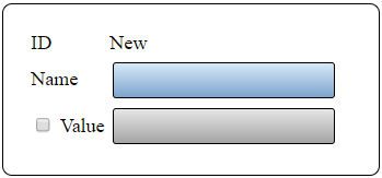
|[[File:ItemsProp.png|center|349px]] | |||
|- | |||
|'''Item ID''' - assigned/generated by the VersaCall Software. | |||
|- | |||
|'''Name''' - enter a name for the item. | |||
|- | |||
|'''Value''' - select this option if you want a different name stored in the database. This Value is what will show on reports. | |||
|} | |||
|} | |||
|} | |||
|} | |||
<br> | |||
---- | ---- | ||
---- | ---- | ||
<br> | |||
{|style="margin:auto;" | |||
=== | |+ | ||
[[File:SearchHeader.png|center]] | |||
|align="center" | | |||
{|class="wikitable" | |||
|- | |||
|<inputbox>type=search</inputbox> | |||
|} | |||
|} | |||
<br> | |||
---- | ---- | ||
<br> | |||
[[File:VC Footer.png|center]] | |||
=== | {|style="background:transparent; color:black" border="0" height="200" align="center" valign="bottom" cellpadding=10px cellspacing=10px | ||
|+style="background:transparent| | |||
|-align="center" | |||
| | |||
|[[File:LinkedIn.png|Follow Us On LinkedIn|link=https://www.linkedin.com/company/versacall/]] | |||
= | | | ||
|[[File:BlogIcon.png|View our Blog|link=https://www.versacall.com/blog/]] | |||
[[ | |} | ||
Latest revision as of 19:29, 20 April 2023

|

|

|
Overview
|
Basic Functionality
|
Data Field Properties
|
Source Type
|
Key Input
|
NFC
|
Barcode Reader
|
List
|
Tally
|
Checklist
|
Look Up
|
Placeholder
|
Static List Items
|
Item Properties
|
|
|

|


