VPIV - Create an Andon Grid Panel
Andon Grid Panel/Widget
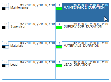
An Andon Grid Pane/Widget will show the state and duration of an alarm on any type of device. The state of the alarm can be used to create color changes in the cell. Our example is for one call station and all 4 buttons. The instructions below can be used for an Andon Table Panel or an Andon Table Widget.
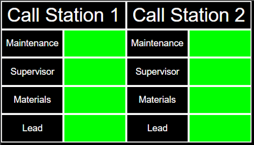
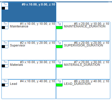
Example of an Andon Grid Panel:
Panel Capabilities
An Andon Grid Panel will accept/enable specific tags and widgets.
1. Tags - Constant, State, Duration & System Property tags are available.
2. Widgets - Andon and Informative Widgets can be added to an Andon Grid Panel.
3. URL – Feature Not Available.
4. Real-Time Report - Feature Not Available.
Getting Started
1. Select the Andon Grid Panel/Widget icon from the Add New list.
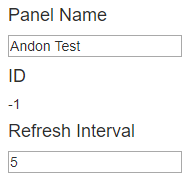
2. Enter a name for the panel/widget in the Panel/Widget Name field under the Properties Tab. Leave the Refresh Interval at 5.
Tags
1. Select the Tags tab - select to Add a tag.
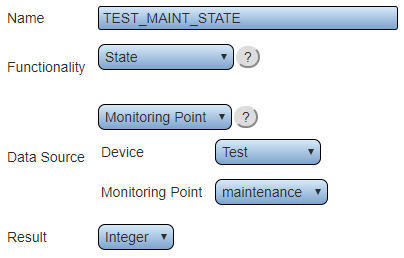
2. Create a State tag for each alarm/button on the Call Station. For more information on creating a State tag Click Here.
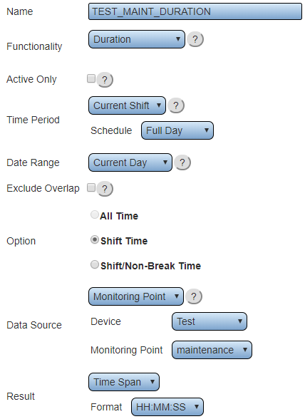
3. Create a Duration tag for each alarm/button on the Call Station. For more information on creating a Duration tag Click Here
4. After each State and Duration tag has been completed, click on the Layout tab.
Layout
Button Name Cells
A Grid panel/widget will require cells to display the name of the alarm/button. This cell is free moving and can be placed anywhere on the provided grid area. Use the Movement icons to move the cell in the grid area.
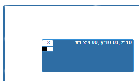
1. Select to Add a Cell – the new cell will be highlighted on the grid.
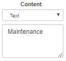
2. Use the Content section to select Text – enter the name of the alarm/button in the provided field below.
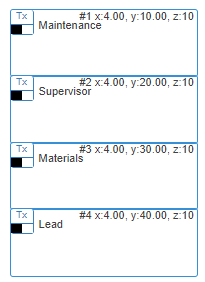
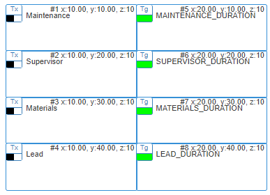
3. Create a cell for each alarm/button – it will look like the example below.
Alarm Cells
A Grid panel/widget will require cells to display the alarm/button duration and state. This cell is free moving and can be placed anywhere on the provided grid area. Use the Movement icons to move the cell in the grid area.
1. Select to Add a Cell – the new cell will be highlighted on the grid.
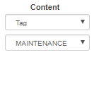
2. Use the Content section to select Tag – select the first duration tag.
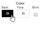
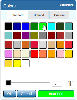
3. Using the color section – select Back – set the color to Green.
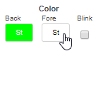
4. Using the color section – select Fore – set the color to Green.
5. Using the Movement buttons – align the cell to the right of the appropriate Button Name Cell.
6. Repeat the process for each alarm/button – it will look like the example below.
Cell Conditions
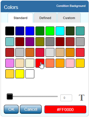
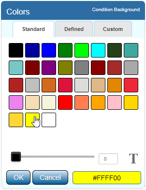
When an alarm/button is activated, the color of the cell can change depending on the state. For the example below, Red will indicate Active/Set and Yellow will indicate Acknowledged.
1. Select the first Alarm Cell.
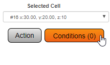
2. Click on the Conditions button in the Selected Cell section.
3. Select the Color tab.
4. Click on the Add Color Condition button.
5. In the Left Comparator field select the appropriate state tag for the alarm & device.
6. Select the (=) sign from the middle field.
7. Type 1 for the Right Comparator field.
8. Select Back - set the color to Red.
9. Click on the OK link when finished.
10. Click on the Add Color Condition button.
11. In the Left Comparator field select the appropriate state tag for the alarm & device.
12. Select the (=) sign from the middle field.
13. Type 2 for the Right Comparator field.
14. Select Back set the color to Yellow.
15. Click on the OK link when finished.
16. Close the Conditions Window with the (X) button.
17. Repeat this process with the remaining Alarm Cells selecting the appropriate state tag.
Station Name Cell
Each group of alarms/buttons and alarm cells will need a heading with the Call Station Name. This cell is free moving and can be placed anywhere on the provided grid area. Use the Movement icons to move the cell in the grid area.
1. Select to Add a Cell – the new cell will be highlighted on the grid.
2. Using the Movement buttons – align the cell atop the button and alarm cells – align the cell with the left side of the cell group.
3. Using the Size buttons – increase the width to cover the button name cells and alarm cells.
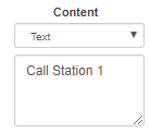
4. Using the Content section – select Text as the type – enter the name of the Call Station in the provided field.
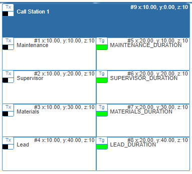
5. The screen will look like the example below.
Final Steps
After all the cells have been created and aligned for a specific Call Station, the user can decide to make additional Call Stations on the same grid or create a separate panel/widget for each Call Station. Click on the Save & Exit button once either scenario has been completed.
